Athletic V Logo
A bold version of the Vanderbilt V is used to represent the Commodores. This variation aligns to the proportions of the V we use for the university, a visual representation of our One Vanderbilt spirit.
Primary Vanderbilt Commodores Lockups
Star V Logo
The Star V logo is our secondary mark for Athletics. The Star V logo should not be the main logo featured for any collection. Since the Star V logo is partially transparent, it should only be used on backgrounds that are Vanderbilt's official colors and neutral colors.
Spirit Marks
Spirt marks, including the Anchor, Mr. C, Hand VU Symbol and others are available for select use. Please contact us for more information.
Core Colors
-

Flat Gold
Pantone 4024 C | Hex CFAE70 | R207 G174 B112 | C20 M29 Y64 K0 -

Rich Black
Pantone Black 3C | Hex 000000 | R0 G10 B0 | C40 M40 Y40 K100
Digital - For all digital creative content, use the HEX codes.
Print - For all print creative content, use the CMYK and PANTONE values.
Apparel- For all merchandise, use Fallback Gold Pantone 4024 (Nike Club Gold).
Clear Space
Clear space is the protected area around a logo. This ensures that no other graphic elements interfere with the clarity and integrity of the Vanderbilt logos.
Use the height of the V logo around all sides to determine clear space.

Minimum Scale
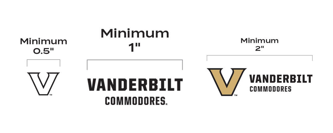
Please use the guidelines below when scaling our lockups and icons down. This ensures legibility even at small sizes.
V logo: A minimum width of 75px or 0.5."
Wordmark: A minimum width of 150px or 1" for the widest elements in the centered wordmark or lockup
Lockup: A minimum width of 250 px, or 2 inches
Style Guide
PDF versions of the university and athletics guidelines are available for download.


