Core Colors
Metallic gold, black and white make up our core color palette. These colors are unmistakably Vanderbilt.
-

Metallic Gold
Pantone 871 C | Hex FEEEB6 to B49248 | R254 G238 B182 to | R180 G146 B72 -

Flat Gold
Pantone 4024 C | Hex CFAE70 | R207 G174 B112 | C20 M29 Y64 K0 -

Black
Pantone Black C | Hex 1C1C1C | R10 G10 B10 | C0 M0 Y0 K100 -

White
Hex FFFFFF | R255 G255 B255 | C0 M0 Y0 K0
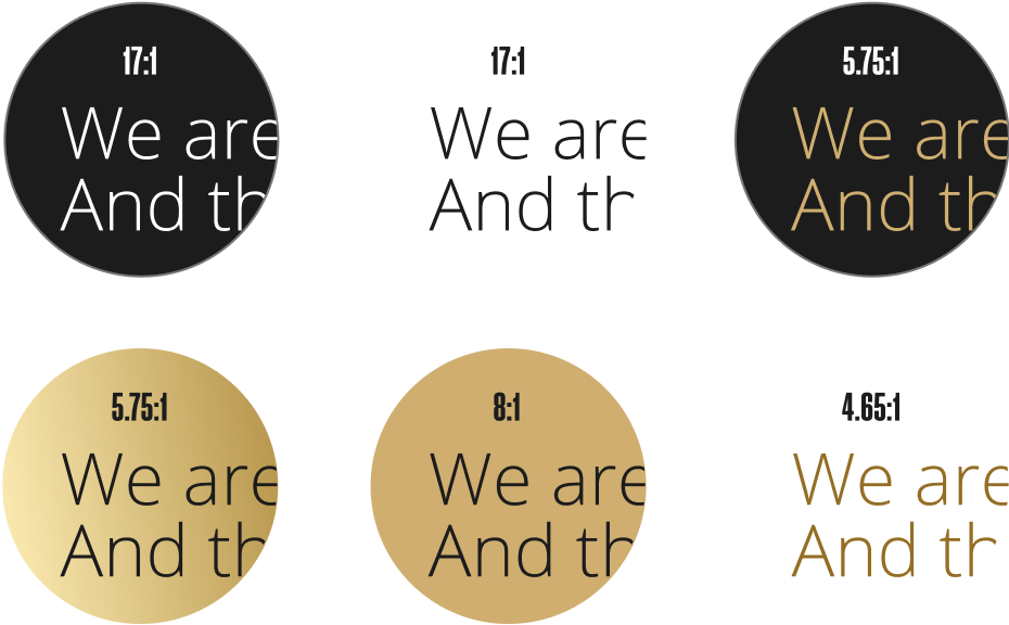
Accessibility
Use of contrast and color is essential to accessibility and to ensuring that our design work is available to all audiences. Our core palette is high-contrast by nature. The color pairings shown below are Level AA accessible. WCAG AA requires a contrast ratio of at least 4.5:1 for normal text and 3:1 for large text. To ensure compliance, please don't stray from these pairings.
Secondary Colors: Neutrals
While our primary palette deploys a high-contrast triad, these colors are supported by warm neutrals: cream, taupes and grays, with higher-saturation hues for impact.
-

Dark Gray
Hex 777777 | R119 G119 B119 | C0 M0 Y0 K53 -

Light Gray
Hex E4E4E4 | R228 G228 B228 | C0 M0 Y0 K11 -

Sand
Hex E0D5C0 | R224 G213 B192 | C12 M13 Y23 K0 -

Cream
Hex F5F3EF | R245 G243 B239 | C3 M2 Y4 K0
Secondary Colors: Saturated
For data visualization needs, such as creating a bar chart or to support Vanderbilt sub-brands such as camps or events, you may take advantage of our higher-chroma secondary palette.


