Typography: Classic Meets Modern
Consistent use of typography is critical to bringing a brand to life. To complement the new Vanderbilt logotype, we rely on a mix of typefaces, which will be able to flex for Vanderbilt’s communication needs. Serif and sans serif type pairings coexist harmoniously.
Please note: the typefaces highlighted below are meant to be accessible by everyone. We prioritize Google fonts where possible (Libre Caslon, Antonio and Inter) because the forms more closely match our premium font selections. Where Google fonts are not possible, we use our universal alternative fonts (Times, Arial and Impact).

Note to Professional Designers
This typography guide is primarily for Vanderbilt faculty, staff and vendors. Please see the section at the end for the premium versions of these fonts, which require a license to use.
For uses such as advertising, social media posts and story designs, high-impact print pieces like admissions brochures, or environmental applications such as signage, please be sure to use the premium fonts (JJannon for display serif and Theinhardt for display sans serif and body copy). Contact brand communications for further information.
Serif Font for Headlines
-
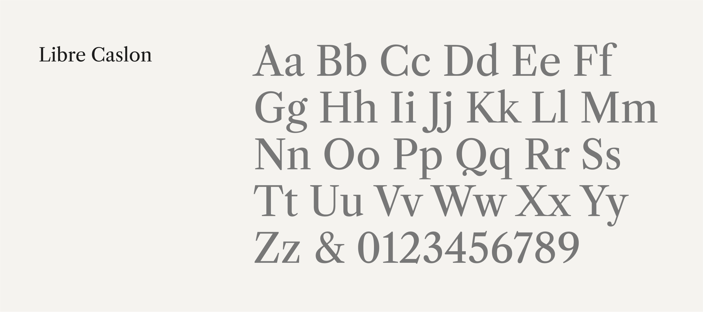
Primary: Libre Caslon
This is the typeface we rely on for display sizes (such as page titles and large headlines). Libre Caslon is a free display type family developed by Pablo Impallari. The goal of Libre Caslon was to distill the essence of Caslon, free it from the limitations of metal printing, and allow it to shine at high definition and large sizes.
-
Alternative Universal: Times New Roman
Times New Roman is the universal typeface we rely on when Libre Caslon isn’t available. It was designed for legibility and economy of space. It has become widely used because of its versatility and readability. We use regular, italic and bold weights most often. Turn off rare ligatures.
Sans Serif Font for Headlines and Body Copy
-
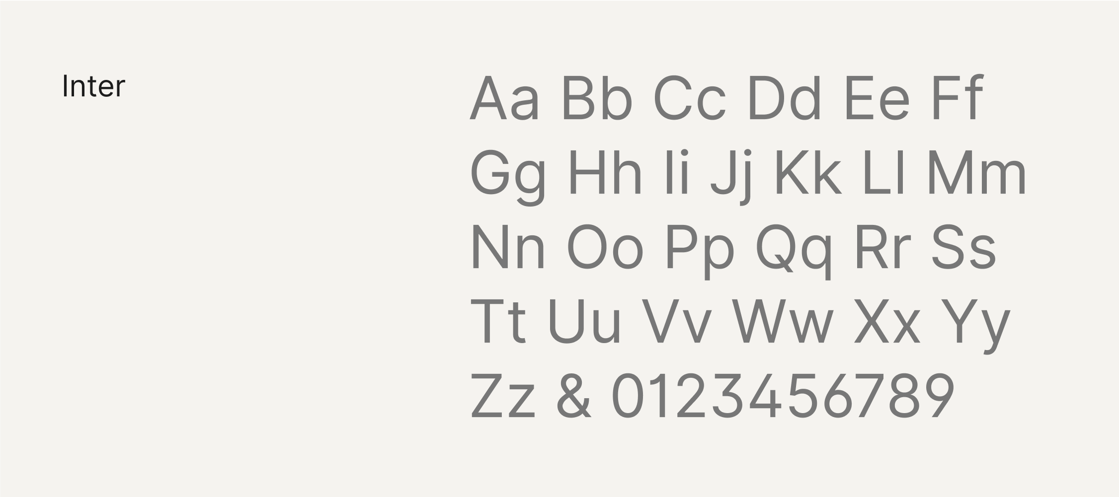
Primary: Inter
Inter features a tall x-height to aid in readability. It has a vertical stature which pairs nicely with our vertically proportioned serif headlines. This is our primary sans serif family which comes in a wide variety of weights for any application. It was designed by Rasmus Andersson in 2016.
-
Alternative Universal: Arial
If Inter is unavailable, we rely on the universal font Arial. A contemporary sans serif design, Arial contains humanist characteristics, so it pairs nicely with serif fonts. Arial was designed for Monotype in 1982 by Robin Nicholas and Patricia Saunders.
Condensed Sans Serif Font for Emphasis
-
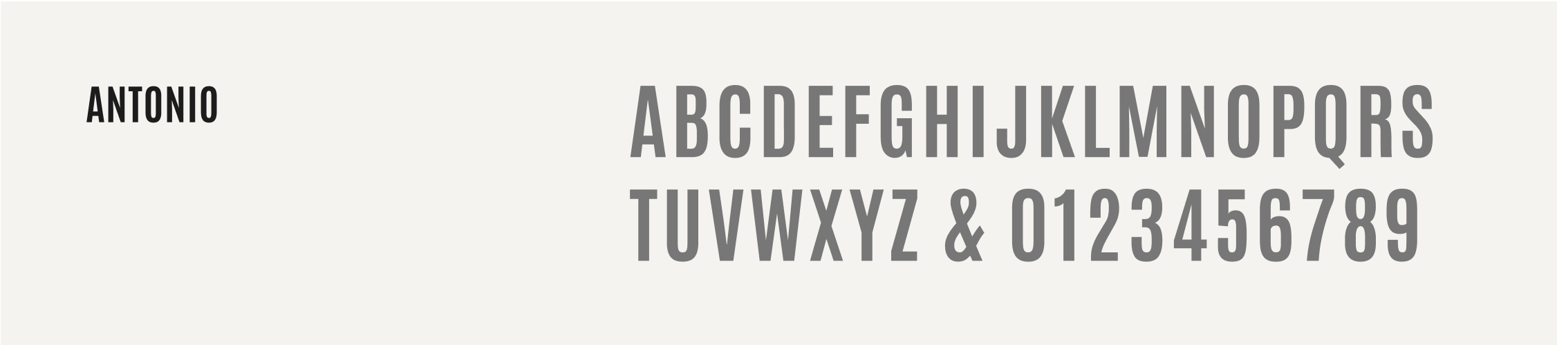
Primary: Antonio
Antonio is a single-weight font, designed specifically for larger display and small bursts of emphasis in all caps. We recommend it to be used for smaller subheads. It was designed by Vernon Adams in 2013. It works best when tracked slightly at 3%.
-
Alternative Universal: Impact
Impact is a sans serif typeface in the grotesque style designed by Geoffrey Lee in 1965. It should be used when Antonio is unavailable. We only use it in all caps. Only one weight is available for use.
Note: The typeface recommendations below are for use by professional designers only and require purchasing a license to use.