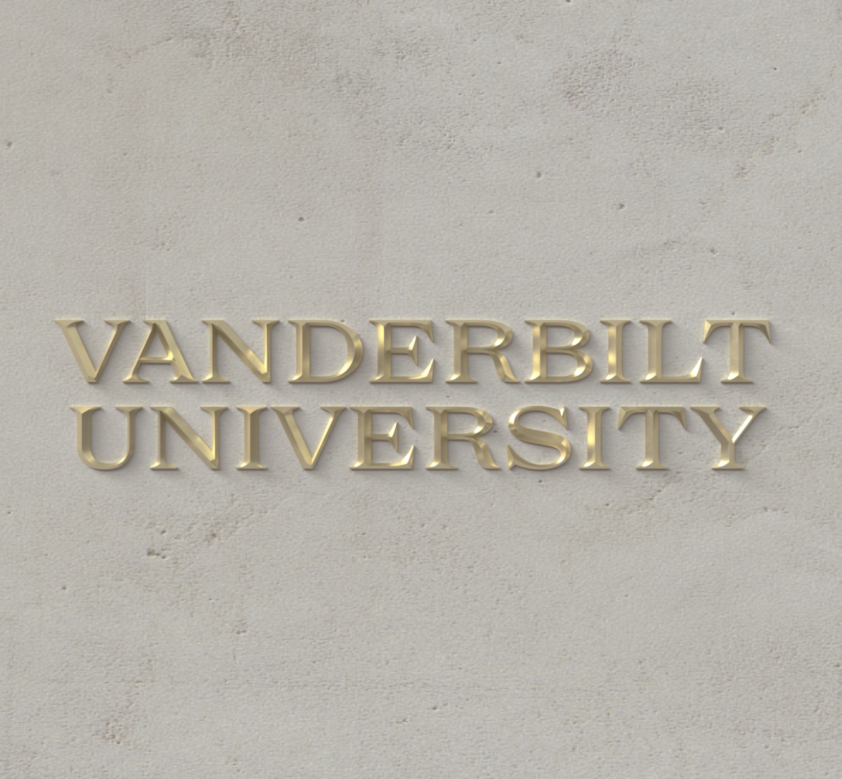
Core Colors
Metallic gold, black and white make up our core color palette. Just like we "own the V," we deploy a consistent, iconic palette. These colors are unmistakably Vanderbilt. Gold is an ancient symbol of wealth and beauty with unique material properties. It's a conductor of heat and electricity, a reflector, a catalyst. It's malleable, ductile and never corrodes. Vanderbilt's association with gold is distinctive and should be protected through diligence about how it's deployed.
-

Metallic Gold
Pantone 871 C | Hex FEEEB6 to B49248 | R254 G238 B182 to | R180 G146 B72 -

Flat Gold
Pantone 4024 C | Hex CFAE70 | R207 G174 B112 | C20 M29 Y64 K0 -

Black
Pantone Black C | Hex 1C1C1C | R10 G10 B10 | C0 M0 Y0 K100 -

White
Hex FFFFFF | R255 G255 B255 | C0 M0 Y0 K0
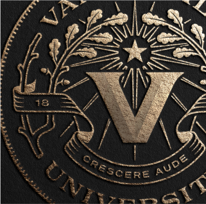
A Note on Metallic Gold
Metallic color looks best expressed materially where light can interact with it. Imagine the metallic gold paint gleaming on a football helmet, or metallic gold foil to accentuate the Vanderbilt seal on an event invitation or diploma.
In 99% of cases, metallic gold ink (PMS 871 C) should be specified when printing with Vanderbilt Printing Services or another professional printing company. Many new "digital" printers are capable of printing metallic gold. The fallback flat gold should only be used when a printer, such as an office color copier, can't accommodate metallic ink. Consult your vendor about using metallic inks.
In digital contexts (for example, websites, presentations and video) we use a metallic gradient to mimic the reflectivity of gold. Our gradient is subtle, pure and bright.
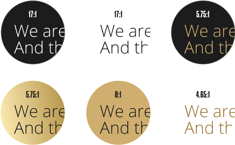
Accessibility
Use of contrast and color is essential to accessibility and to ensuring that our design work is available to all audiences. Our core palette is high-contrast by nature. The color pairings shown below are Level AA accessible. WCAG AA requires a contrast ratio of at least 4.5:1 for normal text and 3:1 for large text. To ensure compliance, please don't stray from these pairings.
Secondary Colors: Neutrals
While our primary palette deploys a high-contrast triad, these colors are supported by warm neutrals: cream, taupes and grays, with higher-saturation hues for impact. Our core colors will make up 90% of use, while 10% can be made up of secondary neutral accents.
-

Dark Gray
Hex 777777 | R119 G119 B119 | C0 M0 Y0 K53 -

Light Gray
Hex E4E4E4 | R228 G228 B228 | C0 M0 Y0 K11 -

Sand
Hex E0D5C0 | R224 G213 B192 | C12 M13 Y23 K0 -

Cream
Hex F5F3EF | R245 G243 B239 | C3 M2 Y4 K0
Secondary Colors: Saturated
For data visualization needs, such as creating a bar chart, or to support Vanderbilt sub-brands such as camps or events, you may take advantage of our higher-chroma secondary palette. Oak and highlight will be the two brighter accents relied upon most.


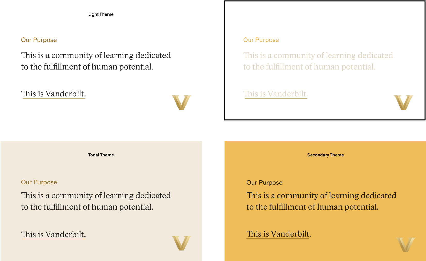
Color Themes
When planning your color theme, consider the four examples above which show ways to use our color system to achieve very different moods. A tonal palette appears more subtle and less contrasted. The secondary color theme employs our brighter highlight as a background, which could prove useful for Vanderbilt-related events such as annual conferences.